People are unevenly distributed on the surface of the planet. Many two-dimensional election maps fail to capture that fact. Rather than show how many people voted for a certain candidate at the precinct, county, or state level, many election maps focus instead on how an area of land voted.
This project explores how visualization techniques might be leveraged to heighten understanding of election results. What simple tools can be used to lessen the disconnect between the number of votes for a candidate and the uneven spatial distribution of those votes?

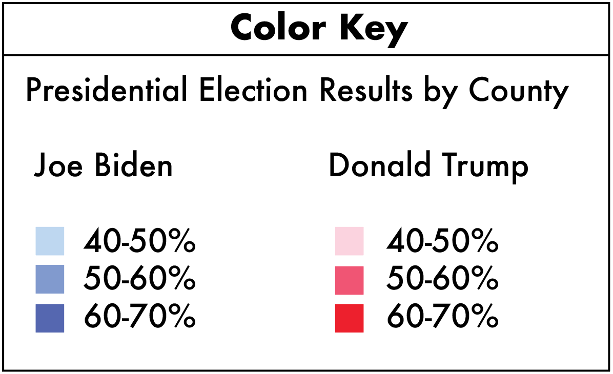
The two maps of Maine above use the same color key to show voting results by county. The map on the left shows a plan view. The map on the right shows a 45° view with the height of each county in proportion to the voting population density (and therefore the volume in proportion to the voting population).
19 respondents were asked: "Here are the 2020 presidential election results in Maine. Who do you think received more votes?" The results are shown below each map.
Process
1st tool: A cartogram is a type of map that can display the size of a place in proportion to its human population. When applied to US elections, cartograms represent voters equally rather than land area equally. In an effort to maintain familiar state/county borders, but achieve the fairer representative effects of a cartogram, this project explored the potential of three-dimensional cartograms where the variable of height represents population (see below left image of Massachusetts).

Sketchup model of MA (county height ∝ county population)
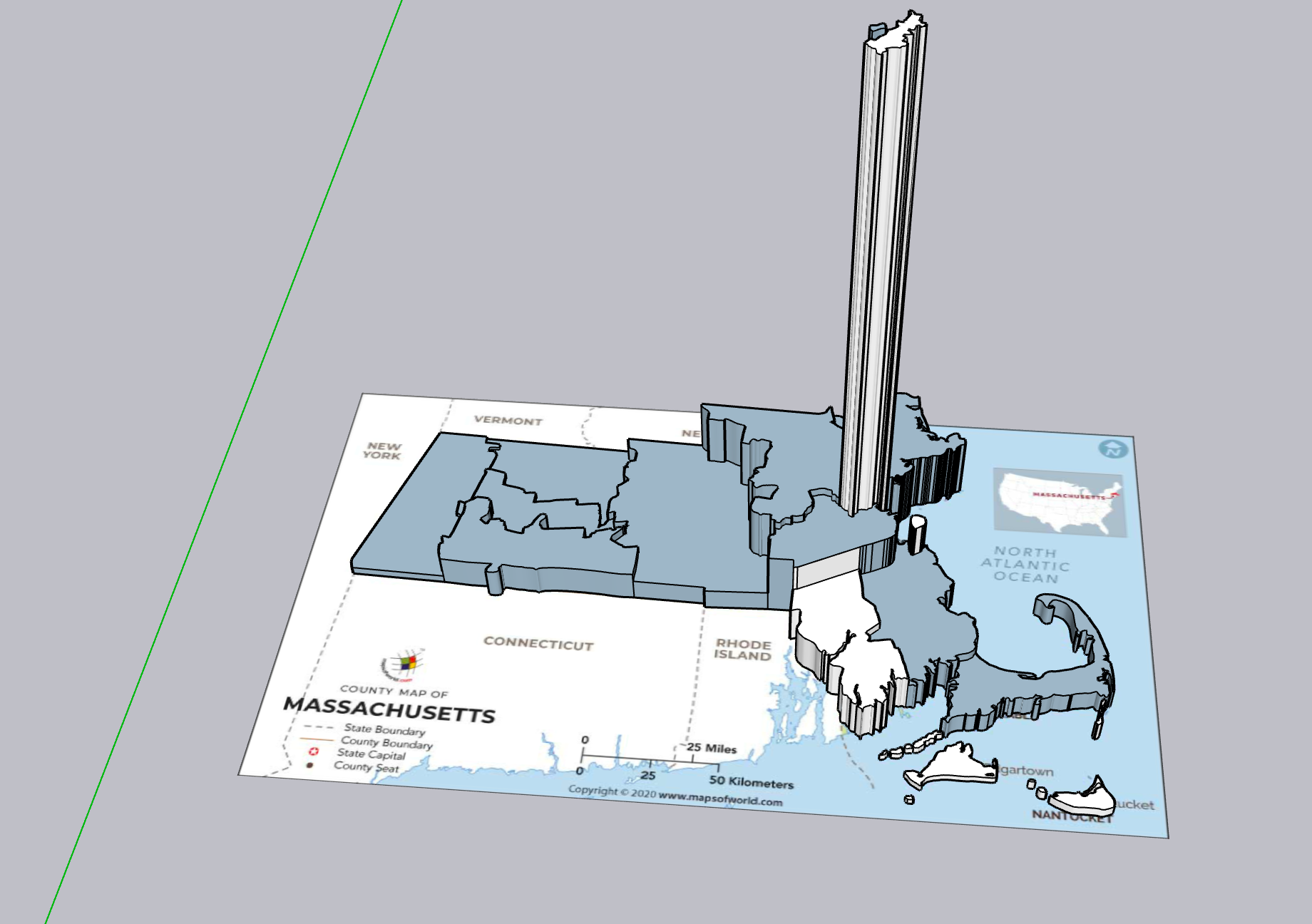
Sketchup model of MA (county volume ∝ county population)
After noticing small, densely populated counties like Suffolk were somewhat hidden, I changed populations to be represented by county volume (see above right image). County height is now proportional to population density. Interviewees liked the metaphor here: densely populated counties are shown as tall spires, similar to how people really are stacked on top of each other in skyscrapers and apartment buildings in cities.
I then applied this method to Maine, a more politically divided state, and I conducted a survey. The actual 2020 election results are as follows: Joe Biden received 53% of Maine’s votes while Donald Trump received 44%. The increase in respondents that chose Joe Biden (21% up to 95%) suggests that this three-dimensional cartogram technique is an effective way to increase understanding of election results.
2nd tool: A website can add interactivity to the election map viewing experience. Interactivity allows a user more agency in analyzing an election map according to their specific goals. The interactive prototype can be accessed below:
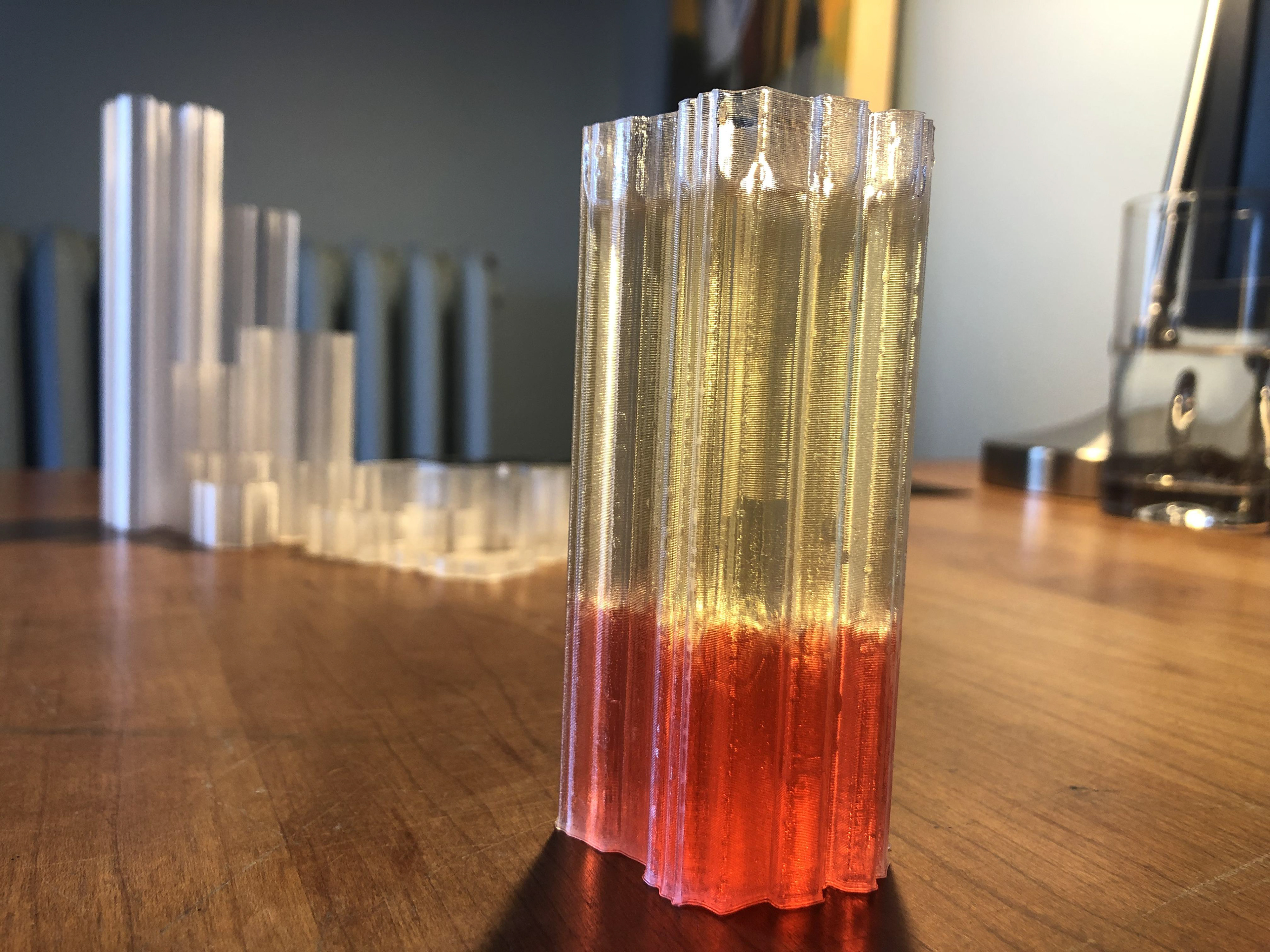
3rd tool: A final point of leverage and exploration for this 3D cartogram technique is physicalizing the data. I 3D printed the Maine counties, making them hollow so they can be filled with some representation of votes then emptied and set up again for the next test/election. The physical model tries to ‘concretize’ the abstract nature of voting and population densities. It also allows a viewer countless viewing angles, and provides a multi-sensory viewing experience.
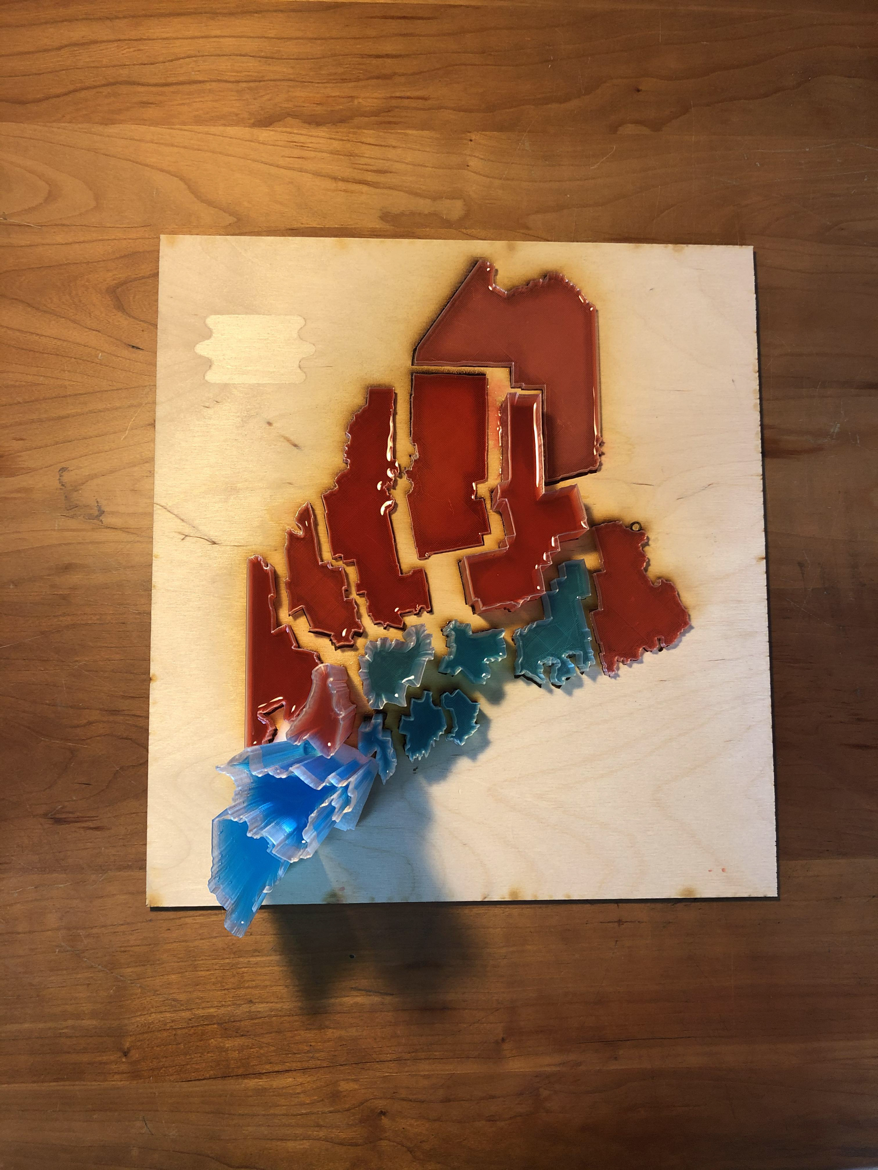
Maine counties filled with Gatorade, darker reds and blues indicate higher voting percentages for that party
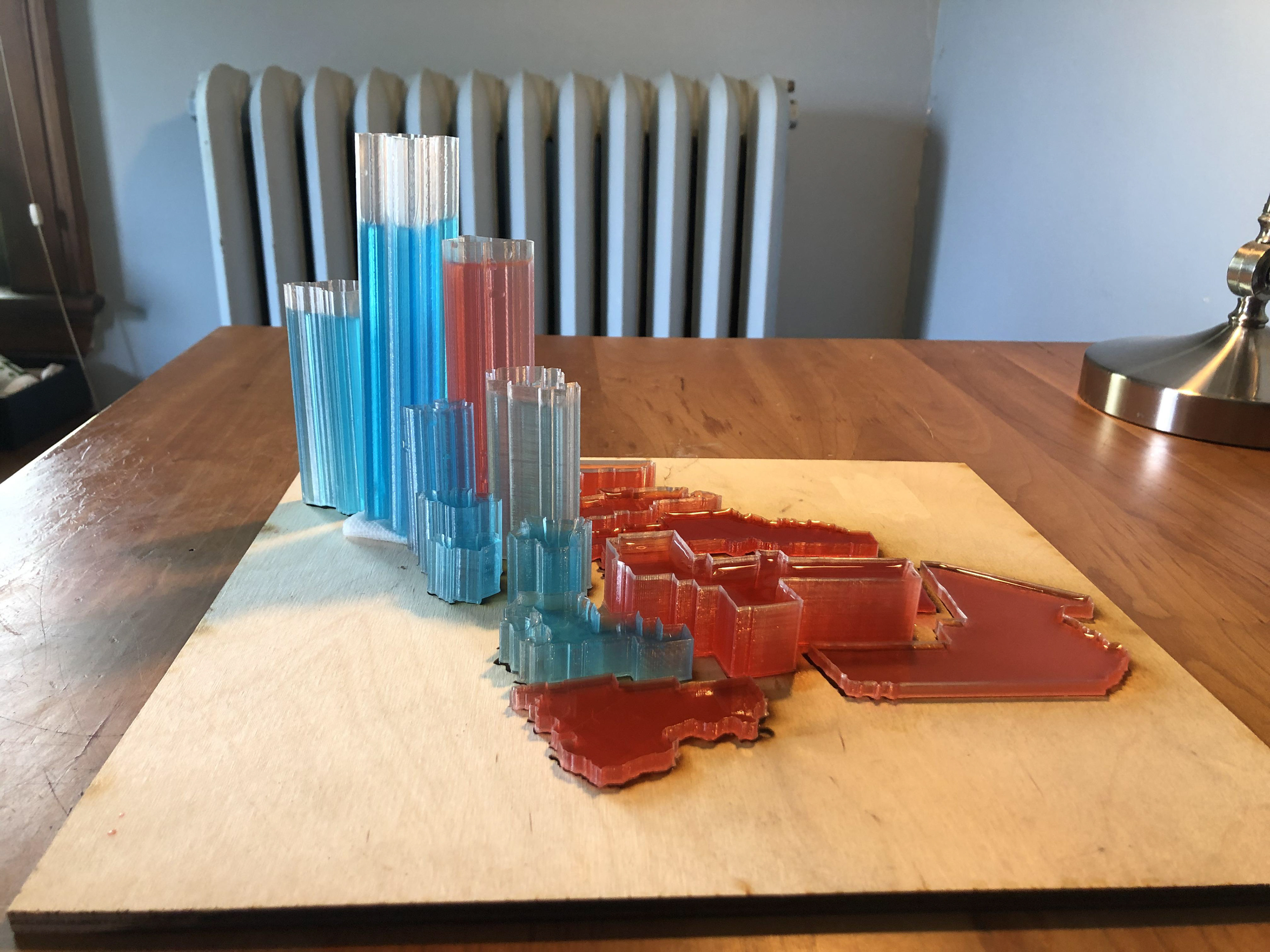
Side view of Maine counties
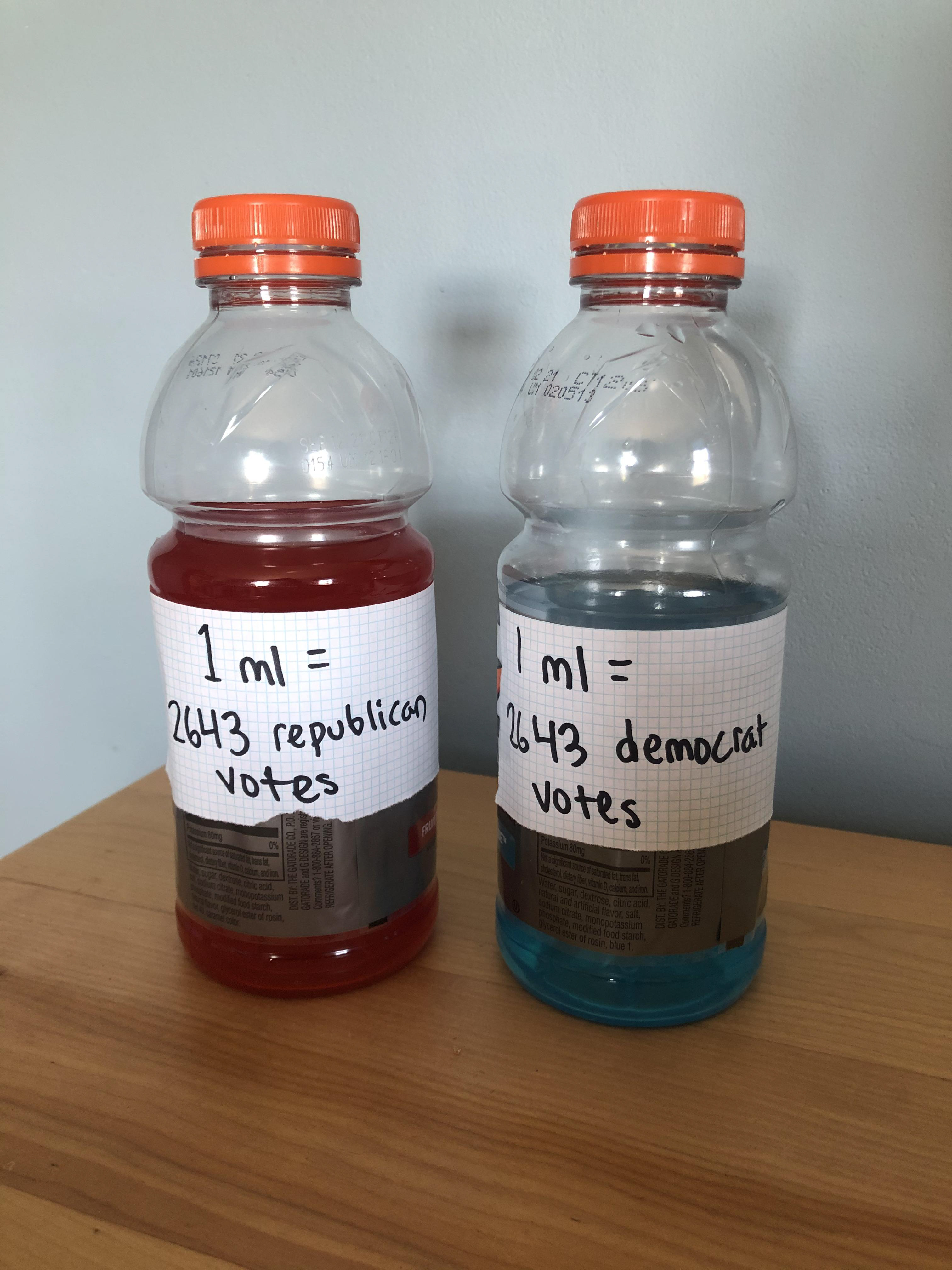
Calculating the # of votes/ml Gatorade for the data sculpture

Experimenting with colored sand as votes
Using oil and water to separate Democrat and Republican votes within a county
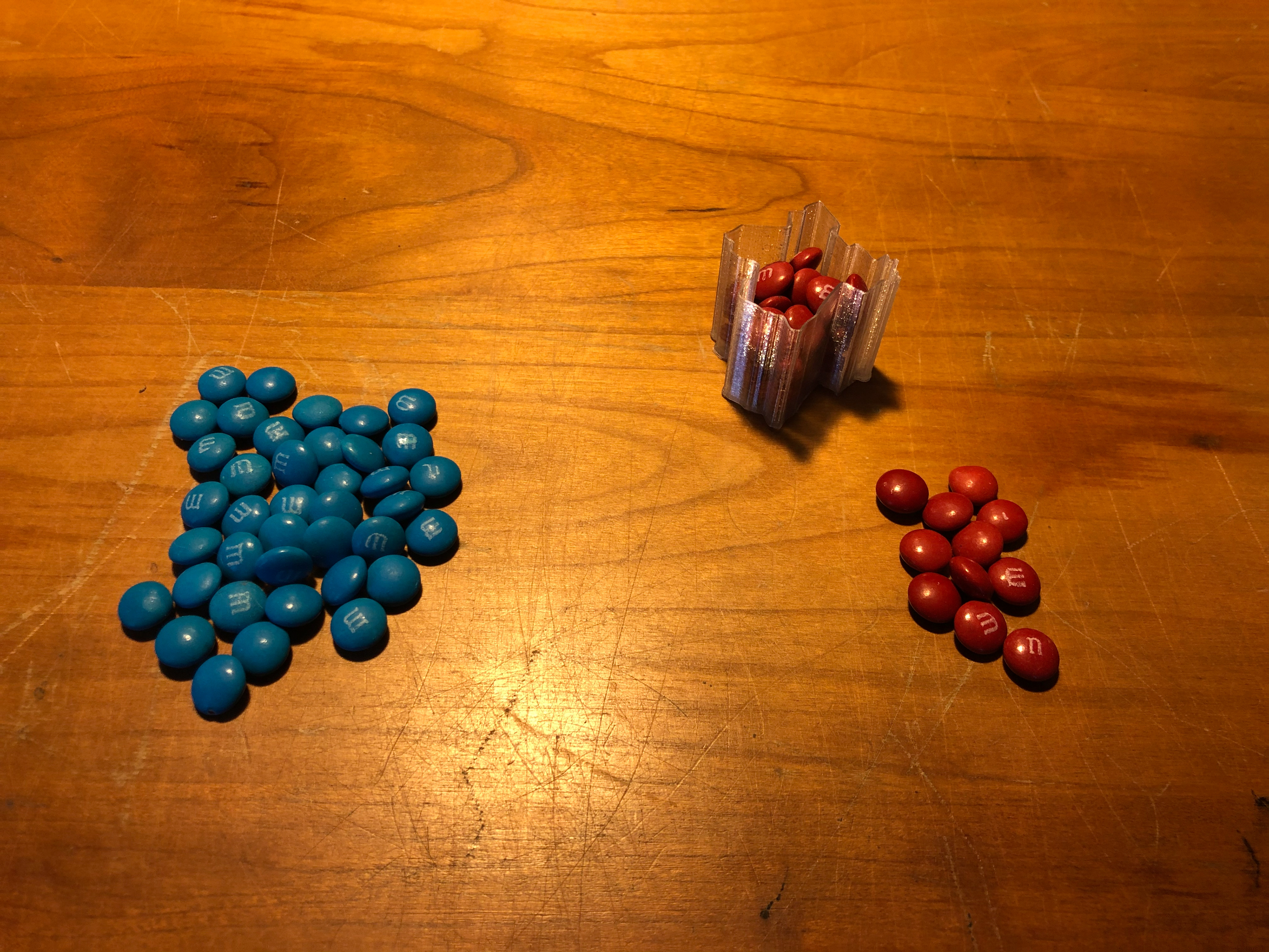
Experimenting with M&M's as votes
Finally, to put election maps into context, I mapped the system of voting in a U.S. presidential election. Below is a concept diagram of election votes illustrating the many steps votes go through - starting with individual votes, then vote consolidation, results publication on websites, and dissemination via news outlets.

For a more thorough write-up of this project, please visit: https://drive.google.com/file/d/1in70Tw5WPnZCKX_ismB_PIfGQ9bsj39U/view?usp=sharing